The new web design is no long user frenziedly. I would show my teachers that all they had to do is find the web site zoom in on the map, click on a station. click on table and find the bird they are tracking. That is gone. Way too difficult to find a bird or station of interest. Please change back to the old map. The new web is difficult for lay person such as a child to use.
Hi Glenn, there are some comments here that may address your concerns. The new site is a big change to be sure, but everything should still be accessible.
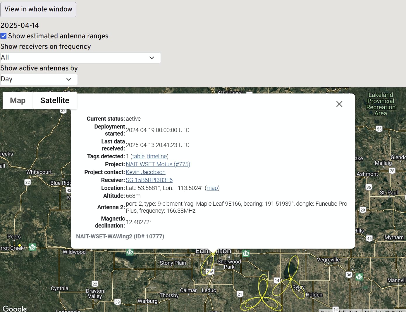
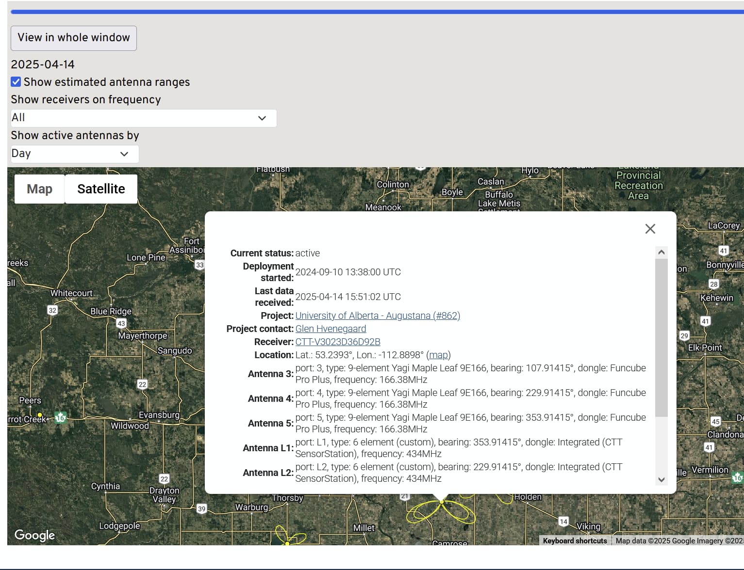
That said, the old receiver map, which I think you’re referring to, is not linked to anywhere from what I am seeing right now. It is in the process of being replaced by the new Explore Dashboard. This is probably the best place to direct your collaborators to if they want to view a particular station’s detections.
The new map has some significant improvements, the most important of which is that detections are now summarized over the entire duration of a station’s operation, instead of only since the most recent change of deployment/configuration. But there are still some features of the old design that haven’t yet been added to the new one. If you’d prefer to visit the old page, it can be found here: Motus Receiver Locations
1 Like
The problem is that if the same bird is only shown once . I want to be if the same bird it detected each time it fly by my station, As I see it now the website only show one detection and does not show if the same bird is detect ate different times. The old system shoe each detection. I find the new map confusing and does not give the information I need. I use the old page but I think that will go away soon.